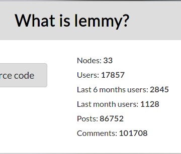
From the-federation.info:

There is also lemmy-stats-crawler:
"crawled_instances": 18,
"failed_instances": 7,
"total_users": 17671,
"total_online_users": 118,
From the-federation.info:

There is also lemmy-stats-crawler:
"crawled_instances": 18,
"failed_instances": 7,
"total_users": 17671,
"total_online_users": 118,
Yeah for sure the UI needs some improvements. The moderation actions are really awkward (they are weirdly positioned text, and the reason boxes are not well aligned either; also you can’t uncollapse them), on mobile the icons search, notifications and all that are vertically distributed instead of horizontally, comments are not marked as read when replied to, the search bar sometimes doesn’t expand properly, when searching remote stuff I almost always have to go forwards and backwards a page for it to show up, on mobile the community’s sidebar shows between post content and the sorting options, etc
Now that I think of it, I really should open issues for all this hehe
Do it!
Doing it! :3