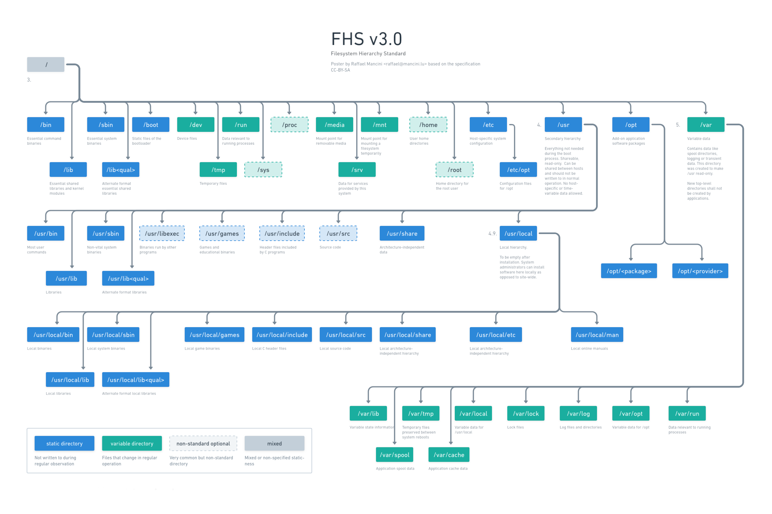
Hey, I’ve recently designed a Poster about the FHS since I often forget where I should place or find things. Do you have any feedback how to make it better?
I updated the poster: https://whimsical.com/fhs-L6iL5t8kBtCFzAQywZyP4X use the link to see online.

Dark mode

Old version


Great but what I’m missing is the information that “usr” does not stand for “user”, like many people think or even say. If it would the name could actually be “user” and not “usr”.
The chart actually does not say what exactly it stands for. It’s “user resources” AFAIK.
It’s worth clearing this up in my opinion.
Thanks for the input. Things are complicated: https://askubuntu.com/a/135679 . Apparently it originally meant “user” but then slowly was used for system stuff. So people invented backcronyms.
That’s just retconning/backronyming it.
/usr does historically stand for user. It’s where the user home directories were on old Unix versions.