tbh I don’t trust anyone who uses right alt or right ctrl
- 1 Post
- 9 Comments

 3·1 year ago
You’ve just never had good poop

 2·1 year ago
I think full height images results in less density of posts on each screen and too much scrolling. It’s annoying to scroll past extra long images that I wouldn’t have clicked on in the first place. Any portrait pictures or phone screenshots take more than a full screen to get past when you factor the header and footer. It just feels like there needs to be a middle ground between compact view (can’t see enough of an image) and full view (scrolling past huge images that take up your whole screen). Thanks for coming to my Ted talk.
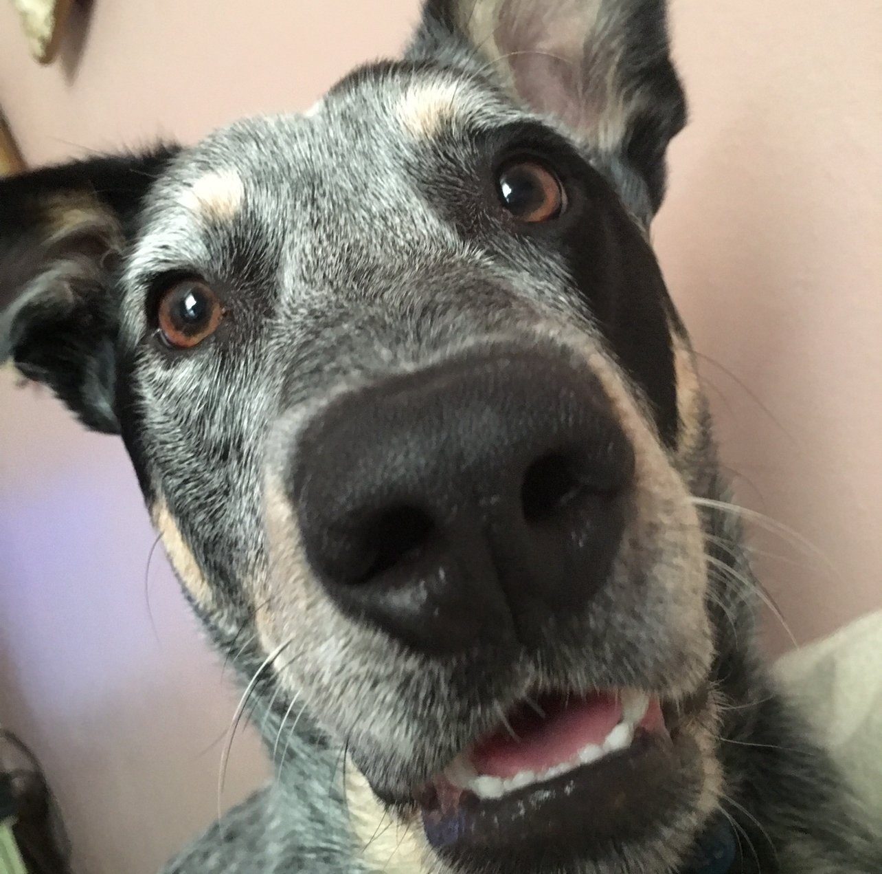
That dog speaks Cambodian

 4·1 year ago
Thanks for your work on this app, really enjoying it so far. I know alot of people wanted full height image previews back, but I personally hate it. Is there a way to disable it?

 1·1 year ago
A staple in my house growing up, we literally called it “shit” and it included kidney beans.


I grabbed Death’s Door on a whim for $8 and I’m blown away. It has so much charm, the music and atmosphere are amazing and it feels great to play. If you like the old top-down Zelda games, don’t sleep on this one.