cross-posted from: https://crystals.rest/post/135229
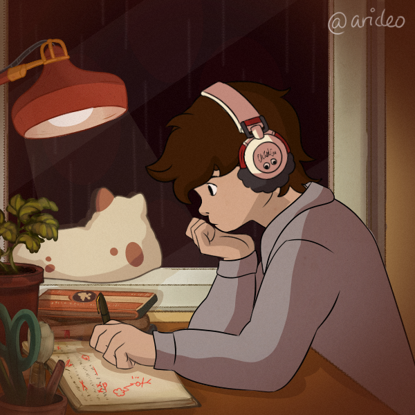
My character that represents me is a young anime tomboyish kinda girl.
I, obviously, am not. Closed the gap a little.
Nice work as always! Just a small remark, the anatomy could be slightly improved to make the pose more readable and identifiable. The coloring and finishing details are top!
Which parts are the ones causing confusion to the overall image?
sorry, i saw the picture on the phone yesterday and it looked like the open hand was coming from the back. today on the pc i noticed the arm. its not a question of anatomy but just giving a bit of highlight on the arm to make it “pop” from the body. once again sorry sorry sorry
You really have no reason to apologize. Even if the arm is visible when you zoom in and look closely, the fact that you have to do that at all makes your criticism valid.
I thought the hand was just floating there Rayman style or poking out of her boob 🤷.
yap, that was my first impression, i just don’t want anyone to take it the wrong way.
no no that’s fine! I was wondering if it was that. I like having it being a matte material without shines, but if it’s causing confusion, I can try and fix this.


