
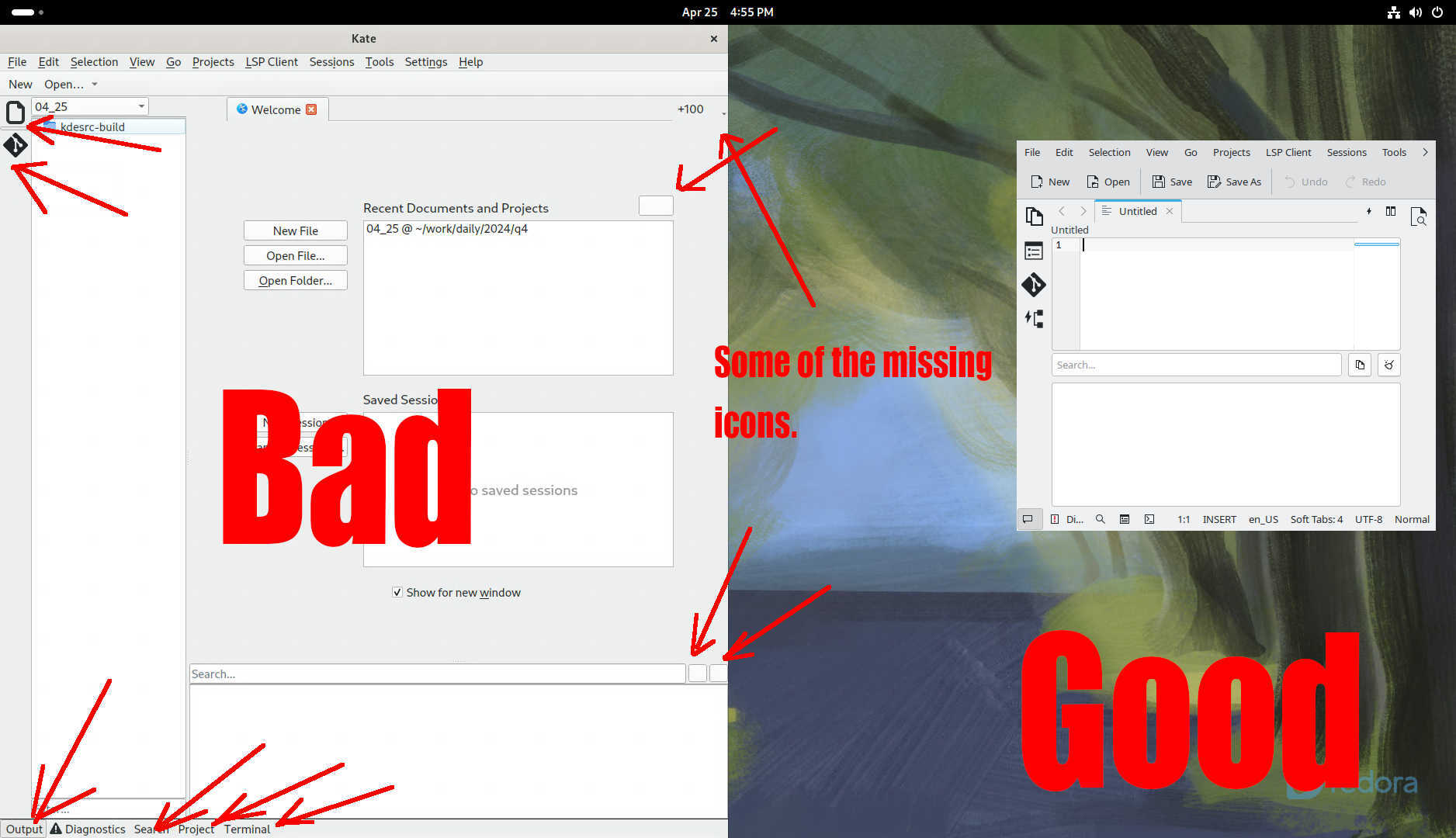
The Adwaita Icon Theme no longer follows the FDO icon naming spec breaking KDE applications on Fedora 40 Workstation and Co. See the concrete state of the issue in the linked article.
The Adwaita Icon Theme no longer follows the FDO icon naming spec breaking KDE applications on Fedora 40 Workstation and Co. See the concrete state of the issue in the linked article.
I’m aware of their reason for dropping support but it’s not sensible to drop a functioning system and replace it with nothing and then talk about how to do it better for years. That post is from 2017, it’s 2024 now and there is still no replacement in sight.
You’ve missed the part where they have no intention of replacing it. It’s bloat. And I agree with them.
Where relevant they’ve added stuff as a core part of the panel, like recently an indicator for VPN connections. If you want to use an application you can alt-tab to it, like we’ve done for decades. Everything else is relegated to media controls and notifications. Appindicators are legacy at this point, and they systematically get cut from modern designs like mobiles.
I agree app indicators are a very strange concept, but the alternative is an app using an extension to place itself in the quicksettings or similar.
Like: Syncthing, Nextcloud, VPN apps. How would they display their small info and sync status?
Notifications, you can have the app fire a notification when it’s synced or disconnects for example. Gnome is working on better notifications right now. Tablets, chromebooks, cell phones… have been doing fine without appindicators; people just have a hard time changing their habits.
Notifications are annoying and should only be used for really important things.
Notifications are more effective at displaying a change of status than a tiny icon turning red. What’s important to someone is gonna vary on a case by case basis, sometimes getting an email is an urgent notification, you can easily turn off the ones you don’t care for or go into DND mode.
On Android apps abuse the persistant notification for just that, while app indicators or a specific area to place those would be way better.
I mostly mute the notifications as they are so annoying, but it is very bad to not have them too.