

- cross-posted to:
- plugins@sh.itjust.works
- cross-posted to:
- plugins@sh.itjust.works
Reddit refugee here.
I have really started to like Lemmy and love the fact that it’s free and open source, but I wasn’t feeling so home with the UI, so I found nice looking style from https://userstyles.world/style/10345/lemmy-world but I personally prefer dark theme so I adjusted some colours and made the radiuses and margins bigger. I thought that maybe someone will find this useful and hence I decided to post it here. I am not a professional programmer, just a guy who likes to tinker with computers so this style may not be perfect. Critique, feedback and suggestions are welcome.
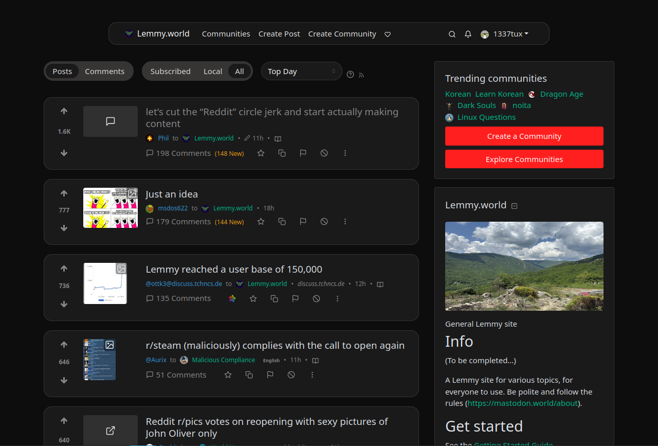
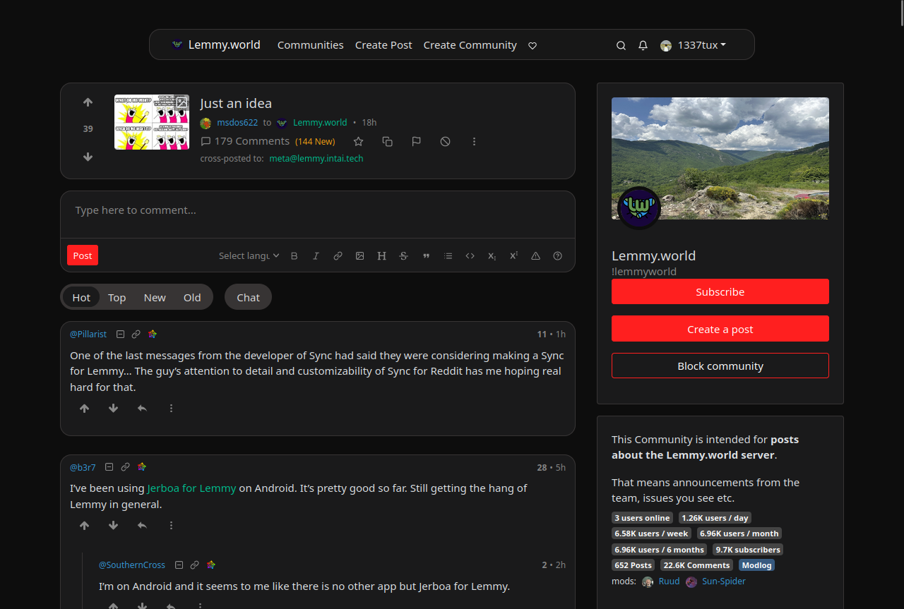
Edit: The colors are from reddit and if you want the colors to look more like the original lemmy, change the bg primary and default to hex #303030 and #222222. I really like this color scheme too
--bg-primary: #303030;
--bg-default: #222222;
Edit2: I have now made some small adjustments using the feedback and suggestion I got from you. I’m really grateful for the feedback :)
I also have now two styles, which have slightly different color scheme https://userstyles.world/user/VILPAUTOEE
Keep the feedback coming ;D Thx
It’s fine on mobile, but on desktop the default UI is ludicrously cramped.
On a 16:9 monitor, which the vast majority of people use, literally over half the screen is empty space.
Compare the default (top) to my custom CSS setup (bottom) in the screenshot below and you can see how much screen real estate is being wasted:
https://i.postimg.cc/PXsST8BZ/lemmy-UI-default-vs-custom.jpg