- cross-posted to:
- games@sh.itjust.works
- cross-posted to:
- games@sh.itjust.works
Ah, the marketing department had to justify their existence, didn’t they?
with AI on the rise of course they do. In our sister company they now axed the whole marketing department and introduced their stupid idea to do everything with ai…
Downscaling as bad as it sounds, makes sense but to dissolve the entire department??? I am guessing someone on top thinks he can just ask chatgpt to make a photo with a shit prompt, post it on social media during his break and its gonna actually work.
that was his idea.
A month later they needed some UI designs so the CEO came with an urgent task to my team and I told him to fuck off and leave my team alone and that he should ask chat gpt for some designs…
I assume they’ve already replaced the CEO with an AI before they replaced the workers, right? That should be the easiest to swap out because any AI generated mistakes would be caught by the people doing the work just like we’ve always done with CEO generated mistakes.
EA can suck it.
Nah, I don’t think anything has made bigger strides towards justifying piracy than EA. Credit where credit’s due and all that.
The hand can be used to fondle the balls or tickle the asshole.
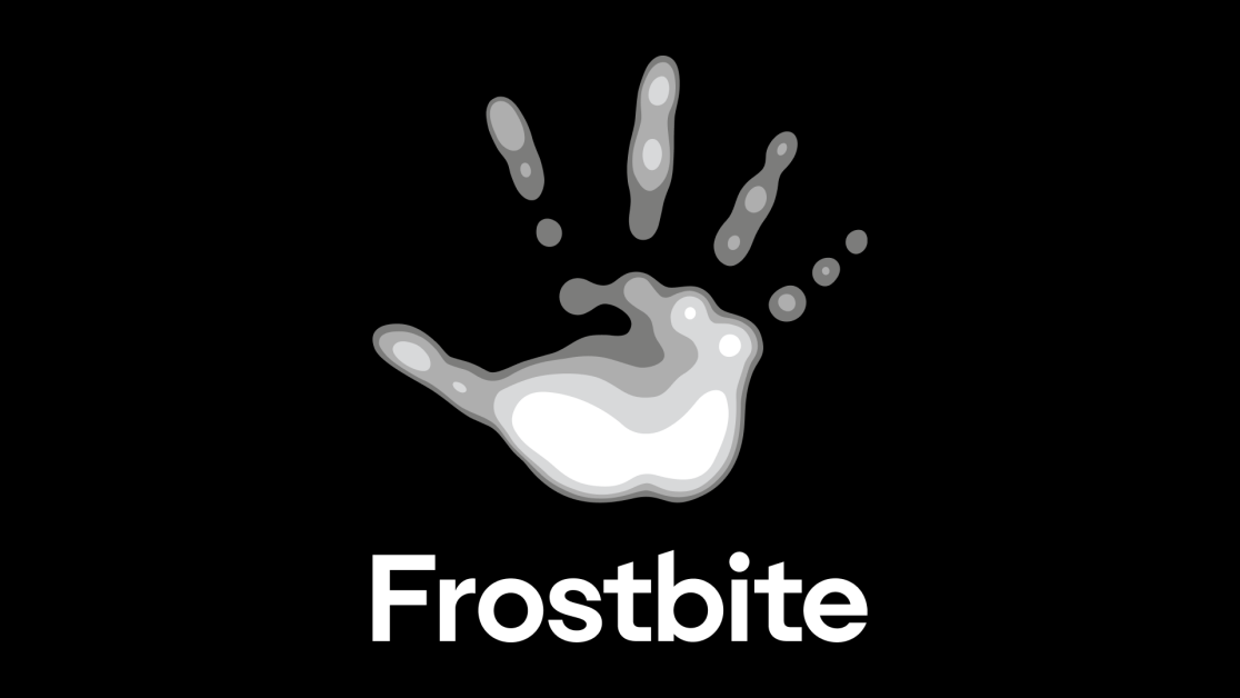
They made the logo more complicated and playfull. Is the long awaited counter-trend train to ultimate minimalism finally leaving the station? I certainly can’t wait!
It’s pretty cool how they documented the design change. I thought the 2013-2023 version looked the best but I gotta admit that the new one looks pretty slick when it’s combined with the cover art.
I really agree. As quick as I am to be cynical about low-impact press releases from a conglomerate, I do find it interesting to read through design changes and the symbolic meaning in branding.
After many conversations about how to represent this new chapter for Frostbite, we realized that starting from scratch wasn’t the answer. We wanted to preserve the best parts of who we already were, and for us, that meant keeping the Frostbite hand.
There are farmers growing food without which life is literally unsustainable making less than these people made for having multiple debates that essentially amount to “should the drawing still be a hand?”, the way in which our society judges and assigns value is so fucking funny honestly
so what? Farmers farm and designers design and talk about design…just pick the job you want to do. Should I now feel bad that I’m a visual designer instead of a farmer ?
the logo sucks though…
Oh don’t worry I’m not condemning the players, (I’m the first one in the line of absurd compensation compared to other jobs for what essentially amounts to writing “computer, do thing” in funny colors), I’m condemning the game. We are not to blame for navigating it in the best way for us, but I can’t help to see some absurdity to it.
I feel you. My mom is a nurse, people like her deserve a shitload of money and not the people who are pushing pixels…but it’s the world we live and and we can always try to give back.
It looks blurry like it hasn’t loaded properly.
You need HD Textures dlcs for that
I really thought they were going to distance themselves from the unfortunate use of a hand to represent the name frostbite.
But no, just went and drew the fingers falling off.
Great work, guys.

