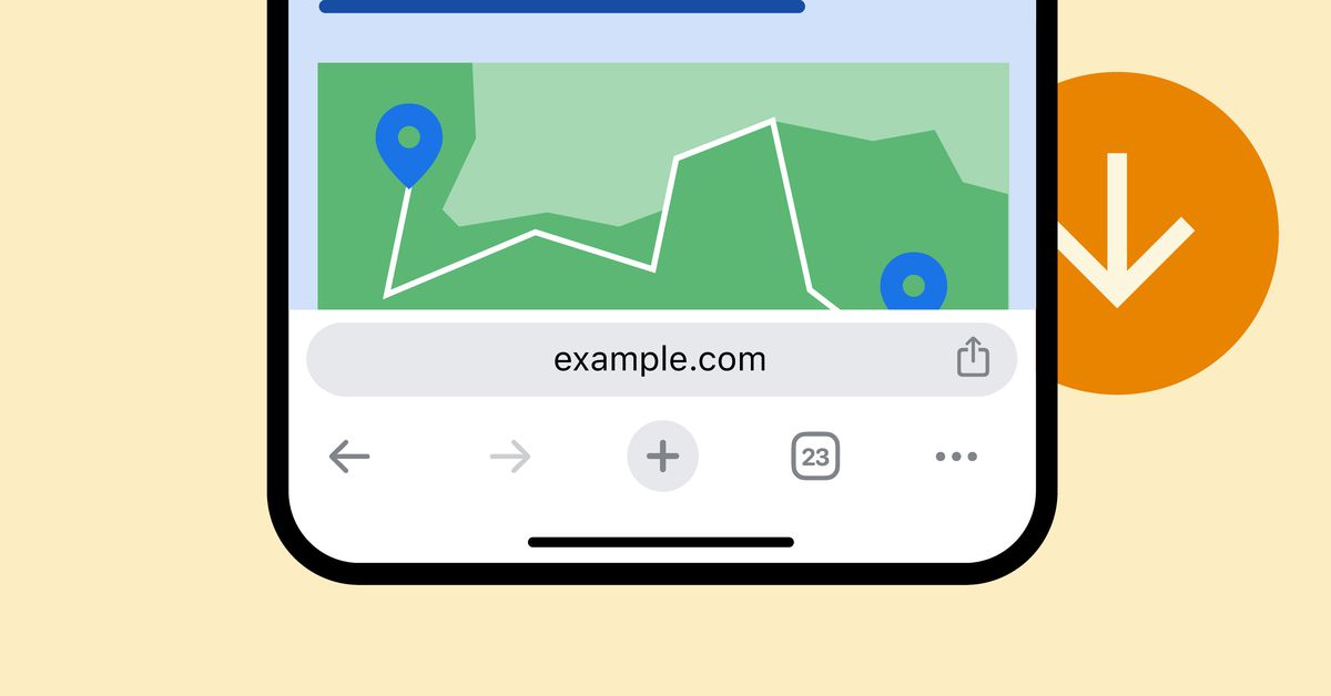
I enjoyed that brief Android Chrome experiment where the browser supported moving the address bar to the bottom. Now that feature has been made available on iOS, but remains AWOL on Android.
Stop using Chrome. It’s a privacy nightmare.
Firefox let’s you do this.
We know.
That would require someone at Google caring about Android. Apart from the amazing team working to modulate the OS, nobody likes working with Android. Look at 14, it’s a code clean up with one feature stolen from iOS (lock screen customisation) which was much better and more interesting back before Lolipop. No master plan, no building up to something. No wonder they can promise 7 years of support for the Pixel 8, there’s nothing in the pipeline.
But it’s not just Android, Google have reached a point where they don’t know what to do about anything. ChatGPT snuck up on them. Rust has decimated any chance of Kotlin being widely adopted. Europe is getting more aggressive about controlling how they operate. Ad money isn’t bringing in what it once did. Any attempts at trying to corner the cookie market are hated. It why we’re seeing the ad block stuff on YouTube and another round of the Google Graveyard, they be running out of money and have no idea how to bring in new revenue.
Damn you are having a bad day.
I think you are over exaggerating here. This isn’t just a case for Chrome to first introduce the new features to iOS, but many other cross-platform apps choose to do so. And it doesn’t need to be because nobody cares about Android. Android still has a larger user base especially when it comes to Chrome. But when you develop for iOS you optimize for tens of devices (maybe not even that) and maybe the latest 3 iOS versions, but when you develop for Android you optimize for thousands of devices from different manufacturers, that put different skins on top of Android, where one runs Android 13, the other one Android 11, and the another one Android 9. Hence when releasing a new feature you first put the work to the iOS version, see the user feedback, change and tweak some things and then put the work to make a functional Android version. I am not a professional dev myself by any means, so I can’t really say everything in confidence, but developing for Android probably takes more debugging and time, because of the variability of the environment the app will run in.
Also for some reason you cannot access app data like you used to. Now if you want to export a Minecraft world you have to connect your phone to a computer.
While I don’t like the address bar on the bottom, I always support more options for stuff, especially cosmetics.
Tbh I think this is more than cosmetics. My thumb is only so long.
Honestly, I think we put way too many important buttons at the top of phones. Address bar at the bottom is a good start though.
That’s where Windows Phone was great. Everything following their design standard had buttons on the bottom
Than I am even more in support for it.
I hate it each time I set up a new Firefox I have to move the bar back to the top. But the fact that it is possible to move it I am OK with it being in the system.
Used to hate it being on the bottom but now prefer it as it’s easier to reach. All the way at the top with as large as phones are these days isn’t as convenient. But ya, at least they give the option for either.
Why do u still use chrome? I suggest switching to Thorium, Vivaldi, Firefox or Kiwi. Edit: all of my suggested browsers except Thorium(at least I didn’t find it, plus it’s a relatively young browser) has bottom toolbar. Same dev is working on lighter Firefox version called Mercury, it’s not on phones yet.
If you disagree, I fully support your right to do that and am glad Firefox offers the option.
But I think address bar at the bottom is ridiculous. I tap it once to type in a URL, and then it’s out-of-sight and out-of-mind so I can view and interact with the actual content. It’s at the top, so I my eyes never have to skip over it or stop when I’m reading something, I just get used to viewing everything under the address bar as the “important” parts.
But again, different preferences and all that…
Depending on what I’m doing I may have to tap it several times. And I don’t like needing to move my hands around my phone to reach the top of the screen.
So many apps feature some sort of bottom nav bar anyway these days, and with the tiniest amount of scrolling it’s out of sight and out of mind.
Oh I missed a bit on the page and want to scroll back up? Why would I want the address bar to pop up first over the text that’s there!
I’m speaking a bit hyperbolically of course, though I genuinely see no benefit in the address bar being at the top. (Also Firefox all the way baybeee)
For the unwillingly people who don’t/can’t move to a more privacy friendly browser, Cromite (a fork of Bromite, both chromium based browsers) do allow bottom toolbar
Windows Phone for more than a decade:
😌
Decade ahead of its time on most stuff, lol. I still miss it.
So YOU’RE the one
Because google has complete control in an android environment and you can go fuck yourself
😅


