
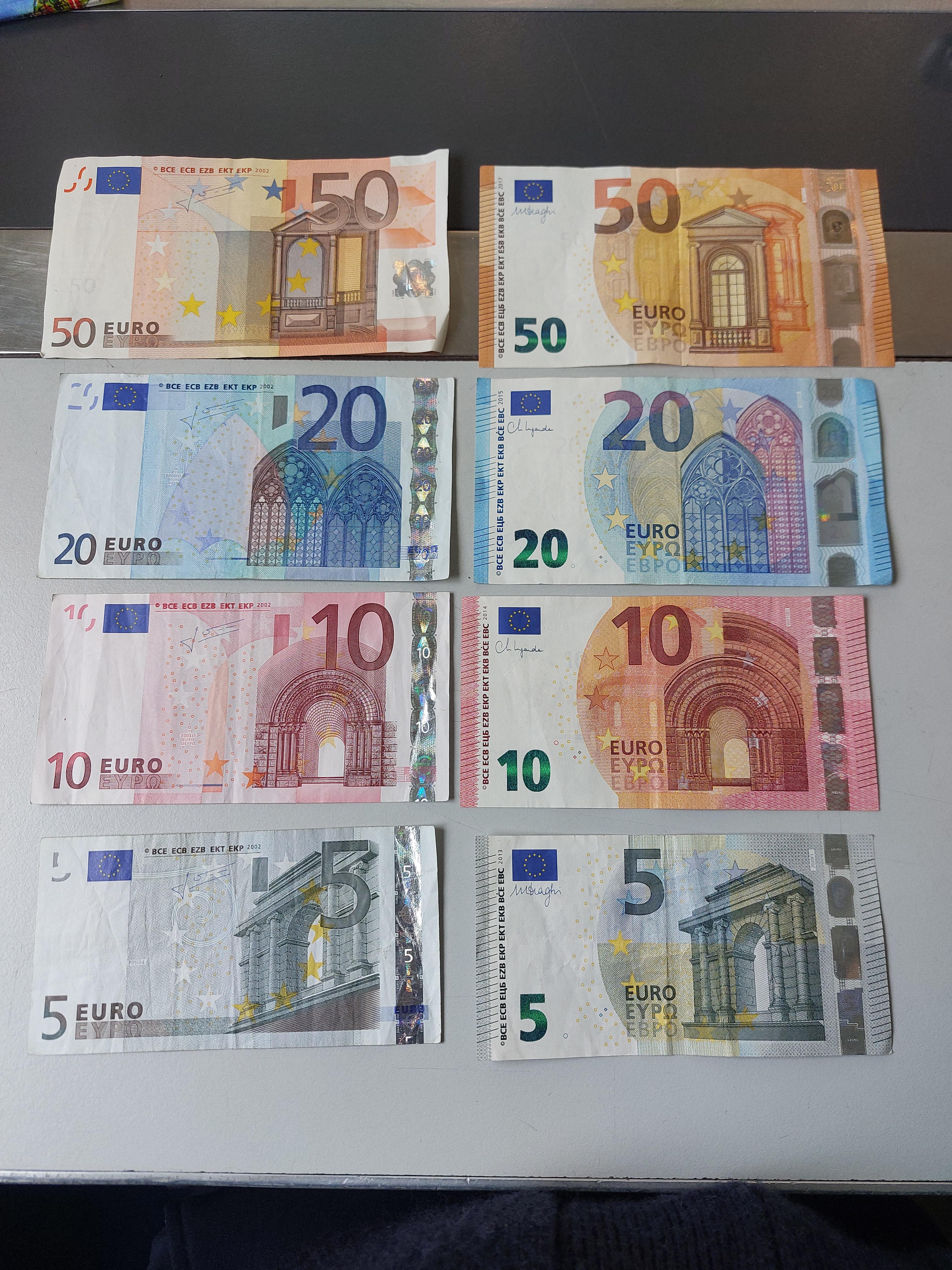
The readability improved with the right, the 5 is almost completely unreadable when I move my phone away (I’m near sighted)
I’m not from Europe and I thought the top one said 150 on the old bill. The readability is much better and consistent in the new ones.
Oh hell, i thought that was 150!
I like that the new ones have more distinct size differences, for people who may be blind this is great as it is easier to tell which note is which by feel, preventing a lot of blind folks getting short-changed.
I think the new series also has some tactile strips on the side which should also help
I really like the new ones with the green coated numbers
I guess the readability on the new set is way better. The bills have always been pretty much whatever for me though, I like the coins though. Especially the 1 and 2 euro ones.
Over here in America just jealous of colorful money.
US bills should be different sizes for the visually impaired. The mint lost their court case, yet here we are still with bills that are all the same size.
New!
New
I wish we have euro.
But on the other hand, both have boring design.
I have vary strong bias, see how polish currency notes look.Yeah, Polish currency looks pretty dope
The ones I really like are the six missing
Five. A new 500 € banknote has never been issued.
Some fuckwit gave me one of those in payment one time. He even laughed and said “Good luck with that”
Yes, you have to take them to the bank, nobody else will touch them
In the early days of the euro I got paid fully in cash and every now and then I got one of those in the envelope. I don’t recall having trouble to pay with it… but those days are gone and haven’t seen a 500 note in ages.
Not only they are not accepted in most private places, I think they are being recalled and slowly brought out of circulation
I hate it when countries redesign money on a constant cycle (looking at you, US quarters). Hopefully these new designs stay in circulation for a long time.
A reminder that the “new” 5€ note is as old as the old one was when the new was released. First series was 11 years old (2002-2013), new is also 11 years old (2013-2024). Higher value notes were introduced later though
Thanks!
I refuse
Eleven years isn’t that long. I’d like to see designs stick around for 20 to 50 years. Redesigning and reprinting money is expensive, and it loses its familiarity and icon status every time it’s redesigned. You also open up confusion where it’s easier to pass counterfeits to tourists, etc. who are unfamiliar with which designs are accurate.
Nobody is about to redesign it again. I think having exactly TWO designs ever is completely fair and you cannot speak of any unnecessarily frequent changes here. The redesign that did happen was crucial for security (a lot of new anti-forgery features added, included ones that are meant to be easy to check for tourists or otherwise) and accessibility.
What I meant is that if they don’t feel the need tp redo it again after the same amount of time, it must mean there was a good reason to do it before, and they probably addressed all the problems they wanted (mainly about security). Also I don’t feel like the iconic look changed that much. The format is the same, the color is the same, and the buldings are similar
50 needed an update I wish they would have went with negative space numbers and not just shifted then into the center. Imagine a “white” number in the upper right. ☯️
I also like that all the four were signed by the same guy (Trichet?), while the new one are Draghi Lagarde Draghi Lagarde
I just wish we could adopt the plastic material like Australia and Canada
ich vermiss den heiermann…
Kauf ihn Dir. Ich hab auch noch einen im Schrank (irgendeine Sonderausgabe wegen wasweißich).
i think i like the new version of all but 5 most, that’s the only one where the illustration doesn’t blend into the background properly.
Also the way the arch on the tenner is cut off halway is strange


